 |
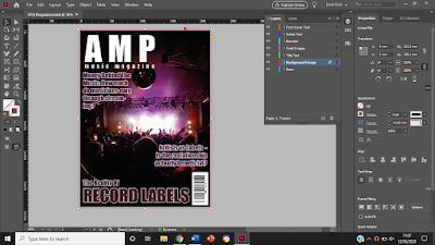
| Print Screen Of Adobe InDesign |
Over the past few weeks, I have been putting together the front cover of my magazine. Some elements were completed through trial-and-error, in an attempt to find the right composition for the cover. My sibling, who uses InDesign as part of her Graphic Design degree, has explained some features to me, some of which are yet to be used. These include how to adding the background image in a way that fits the size of the cover and is not blurry, and how to split the page into equal columns, which will become useful once I start to right my article, in order to get the authentic look of a professional magazine.
Whilst I have learnt from the process of making the cover thus far, I am not completely happy with how it looks. I feel as if I should choose a photo with a lighter colour scheme, as most of the published covers I have researched do the same. However, I still hope to be able to use one of my own concert photos, like the one in the screenshot above. This will allow me to use more colourful, eye-catching headlines and subtitles, and may make to cover look more professional and realistic.

Comments
Post a Comment