Throughout my project, I have developed my design much more then I had originally thought. The paper plan I had created (shown in an earlier blog post) gave me a nice starting point for the design ideas but, as my skills in InDesign progressed, the quality of my design did too. As time passed, my magazine looked a lot more professional and began to fit the vision that I had for it when the idea of a magazine began.
This version of the timetable is much more aesthetically pleasing when viewed alongside the other pages in the magazine. The dates included were sourced from the official O2 Academy Sheffield website and show when events were meant to occur pre-pandemic. I chose to include the non-rearranged dates because there was no mention of the pandemic in the rest of the magazine. When I began creating the final product, I made the decision to create for an industry as if it was not effected by COVID-19. Music had been greatly impacted, but I wanted my magazine to focus on the information I thought was key to an audience who wanted to learn rather than those already in the know learning about how COVID affected the industry. This timetable is the first sign of this direction in the magazine and gives a path for it to continue across the other pages. It would have been impossible to not focus massively on the impact of the pandemic had it been mentioned, so I chose to not speak about it at all rather than understate it massively to reflect my ideas.
This image shows the left-hand side of the spread. This is where the main design feature can be found and the other page is simply text in the three columns. The graphic in the centre is still fairly simple, but the skills involved are much more challenging. The black areas of the centre graphic is a PNG image found from Google, but the other aspects of creating it were entirely new to me. I had to create a white circle around the edges to create contrast and then use other functions to wrap the title text to the circle itself. InDesign has a function to wrap the body of the text around an image and this all works together to create a graphic that is bold, but integrates into the design of the page.
Independent Artist Spread:
The new spread design once again incorporates the cool-toned images I wanted to have throughout the magazine. I showed some new skills in this spread too by creating the circular cropped images on the page instead of the previous image. I also continued the rectangular shape found on the first spread in order to create a continued theme throughout the magazine. I felt that, once again, this new design still suits the simple idea, but it much more interesting than the first attempt.
The remainder of this blogpost features some images of my progress and descriptions of how the design has developed over time. Most of the changes focused on creating a cohesive design
Front Cover:
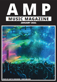
The front cover of the magazine began as a full-page image with white lettering layered over the top. I originally chose this because of the colourful, more alternative design it presented. I didn't have any portrait images of a musician that I could use without copyright as I had seen with the pieces of textual analysis I had done with real magazines. Most of them featured a portrait image with the main focus of the inner text directed at that musician. Since my magazine had a pretty wide focus in terms of how much of the industry I wanted to cover, I had to mirror this in the cover image. Once I had refined the design, I chose a more music-focused image that fit with the more colourful images seen on the other spreads on the inside.
The image on the left is a screengrab of the front and back covers and their design when I first began creating the magazine. This image seemed to fit the alternative audience I had in mind because of it's inclusion of more political images, but didn't give the immediate idea of presenting a music magazine, which was key to being an effective design. If someone viewed this cover on a shelf, it wouldn't jump out as music information, which is why I altered it.
This image shows the new design of the front cover, which was featured on the final print. The image is much more suitable for what I believe to be the desired purpose. If the title wasn't present, I believe that this image gave the impression that what featured inside concerned the music industry and the day-to-day workings of it. This design also maintained the simple lettering from the original design. I chose this because it created a nice contrast from the busy image from the first design and I felt it served the same purpose in the second design too. This design is also much more cohesive with the rest of the magazine than the original. It looks a lot cleaner and more professional, especially with the inspiration of it coming from a real publication.
Timetable:
The timetable was a feature that I found in a lot of the textual analysis research that I had completed. It was very helpful in serving as a reminder for the intended audience throughout a publication. By altering the usual timetable and creating one for a local venue, I was able to direct my magazine at the local audience I had in mind.
I originally planned for the venue timetable to follow the colour scheme of the 02 Academy website. However, I decided to change this later in the design process because it didn't seem to fit the rest of the magazine. Changing this page to have a white background and black text helps to contrast the black contents page found next to it. This looks a lot better in the magazine as a whole, but the layout of the page remained the same from this blue formation to the final edition.
Streaming Services Spread:
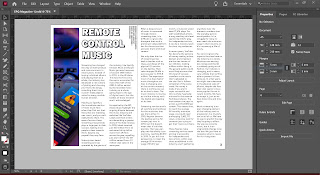
I originally began designing this spread in the same way I had planned it on the paper copy of the magazine. I knew from the beginning that I wanted to have alternating pages of black backgrounds with white texts and vice versa. I felt like this was the best way to add variation to the pages in such a simple colour scheme whilst continuing with the design style I had in mind. Once I had designed the contents page with a black backing, I changed this spread to have white pages to contrast the layout.
When I started designing this page, I was new to the software and the approach to magazine design. I believed that the simpler the design, the better my magazine would look. As my project developed, I realised how this is slightly unrealistic, The simple design is effective, but is much more pleasing when including an eye-catching image too. The green colour found in this old design also didn't help with design cohesion and I believed I could come up with a much better design that still holds onto the simplicity I had aimed for.
The image on the left shows the final design for this spread. I knew I had to keep the simplicity because of how text heavy the spreads would be, but I hope that the image has made it a little more interesting. I chose this image because of it's relevance to the content, but also to include something that would be heavily recognisable for a lot of the audience. The Spotify interface in the image is something seen by a lot of music fans, and the image helps to continue the more cool-toned but bright colour scheme I had chosen for a lot of my images.
Record Label Spread:
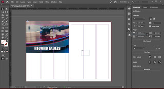
This spread began in a very similar way to the last, with a very simple title and graphic. I had started with the idea of images in this spread, but I felt that the design didn't really challenge me or encourage me to develop any new skills. I was simply placing an image and adding text, not learning any new skills to add interesting features to my design. I felt that this first design was way too simple and didn't really add anything positive to the design overall.
In this spread, I continued with the newly-developed image-based design ideas, once again in a much simpler layout. The title of the spread was extremely basic and didn't really seem to be a part of an eye-catching design. From the inspiration I had from textual analysis, I had hoped to create a cut-out image with wrapped text for the right-hand page. I had a small amount of previous experience in image editing and found it fairly easy to navigate Photoshop to produce similar results.
Once this was finished, however, I felt that this cut-out image wasn't fluent with the rest of the design and stuck out quite boldly. When placed next to the page with the spread's title, the image didn't blend into the pages well, so it didn't achieve the aims I had for the design.
Filler Pages:
The other pages found in the magazine were created after the inner pages. At this point, I had figured out how to create the design I had wanted. I was able to pretty much develop them to the level I had wanted to within the first process of the design. The contents page didn't mirror the design I laid out in the paper plan but I, once again, felt that this fits a lot better with the rest of the magazine as a whole.


Comments
Post a Comment