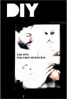
Whilst looking through the examples of magazines that I already own, I found that the copy of DIY magazine I had was very similar to the kind of magazine that I wanted to create for my project. The small A5 layout gave me many examples of how to create an aesthetically pleasing, cohesive magazine whilst maintaining the fan-zine style of the product as a whole. The inside design of this magazine, I felt, was a better example of the type of design I wanted to produce. Whilst the issue included a lot of original photography, it also gave great examples of how to use both images and text together on smaller pages, but maintaining the unique, cohesive design found in all music magazines.
From this copy of the magazine, I was also able to get an understanding of the filler pages that were suitable for the type of magazine I wanted to create. The images below are from DIY magazine and gave me some inspiration for the pages I wanted to add, as well as some design ideas. I may not have been able to recreate some of them, because of my lower level of skills, but I hope to have gained at least some inspiration.
Image 1:This image provides an example of a timetable for a music event that could be found in a music magazine. This page gives information on a festival, rather than the local venue I was aiming for, but it provides a good example of how these types of pages are set out when they are often seen in real publications. I found this kind of page in most of the music magazines I had looked at and felt it was important to include and could be a subtle but impactful way of enforcing the idea of the local audience I had in mind.
Image 2:
This page inspired what I had hoped to do with the design of the double spread for the Independent Artist article in my magazine. I wanted to cut out the drum kit and person in an image I had found on Unsplash. This was in the beginning of building my skills, however, I didn't really know how to integrate this into the design as whole , so I eventually changed it to for some more solid shape-cropped images on the spread instead. This perhaps could have looked a little nicer if I had found an image in the same colour scheme that mirrored the front-facing perspective, but I like the design this had developed into.
Image 3:
The front cover of this copy of DIY was my main inspiration for the front cover of the magazine. My original plan was far too busy and I felt it did not fit in with the rest of the design. By including simple white lettering on a black background, I was able to begin the black and white design found on the inside with the cover, whilst still allowing it to feel professional and realistic. I feel that the design may have fit more if the cover image I chose was in black and white, but the colourful image I chose fitted with those found on the inner spreads, meaning it was suitable when viewed with the other pages as a whole.
Image 4:
This page gave me the inspiration for both the original design of the independent musician spread and the final design of the record label spread. Incorporating an image of the topic being spoken about is a really effective way of making sure the design and writing flows together nicely. I felt as if the design I had come up with to do the same with a cutout of a drummer didn't lend itself to the cohesive design I was looking for, but I was still able to keep this idea in the magazine by wrapping the text around a graphic of a vinyl and the spread's title. It may not portray the same ideas, but I believe this inspiration was helpful in finalising the end result of one of the spreads.


Comments
Post a Comment